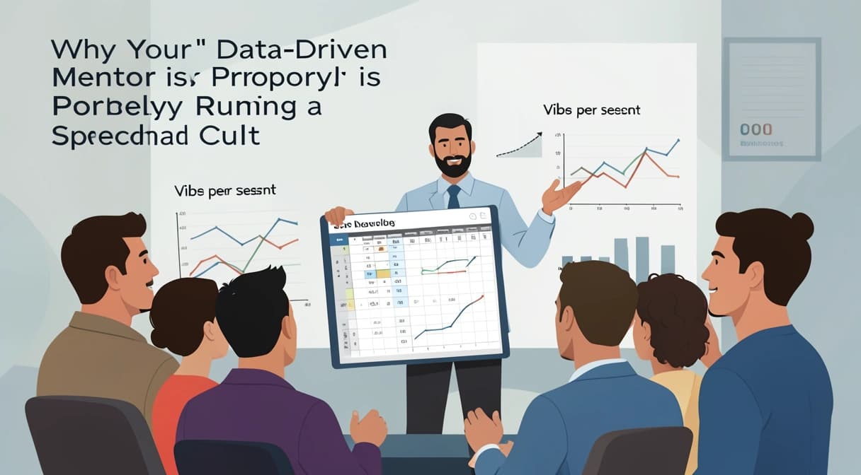

You’re not building a startup. You’re conducting a symphony of cells. Your mentor, a self-proclaimed “quantitative visionary,” has you tracking “weekly active whiteboards,” “pivot velocity,” and “synergy coefficient.” Your real revenue? Flat. Your actual customers? Confused. But your dashboard? It’s a vibrant tapestry of colors and arrows, all pointing gloriously upward. Congratulations. You’ve joined a spreadsheet cult.
This is the modern data-driven grift. It’s a con that trades on our deepest entrepreneurial insecurity: the fear of uncertainty. For $5,000 a month, a guru will sell you the illusion of control, wrapped in the aesthetic of science. They’ll drown your doubt in a flood of vanity metrics that measure everything except the one thing that matters—whether anyone will pay for your product. The March 2026 exposés on LinkedIn’s “growth alchemists” revealed a simple truth: their million-dollar “proprietary analytics engines” were just Google Sheets with conditional formatting. The cult isn’t new. The robes are just pivot tables now.
What Is the Data-Driven Grift?
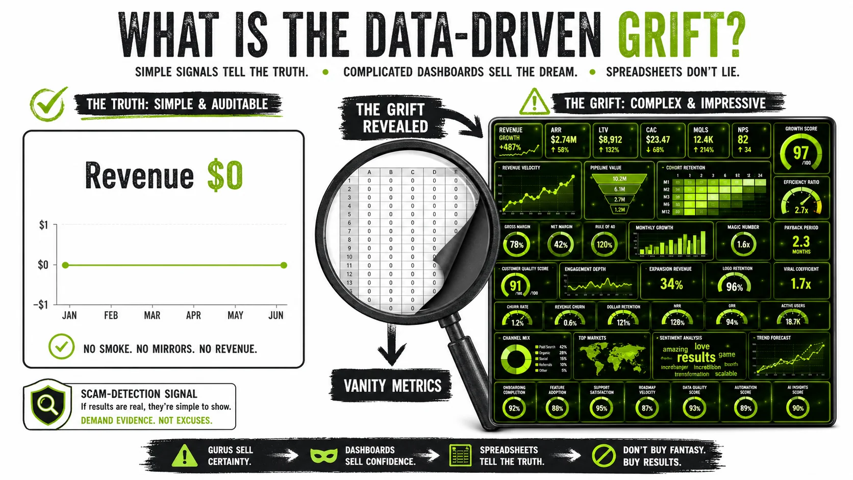
The data-driven grift is a performance. It’s the use of complex, often irrelevant data visualization to create an authoritative facade, distracting from a lack of genuine business progress or product-market fit. It transforms the simple, scary question “Are we making money?” into a dozen comforting, complicated ones like “What’s our MoM cohort retention of free-tier users who logged in exactly twice?”
At its core, this spreadsheet cult operates on a simple substitution. Real, hard metrics that indicate survival (revenue, profit, customer acquisition cost) are replaced by soft, activity-based vanity metrics (downloads, page views, “qualified leads” that never buy). The goal isn’t insight; it’s insulation. As long as the cult’s dashboard is green, the guru’s authority remains unchallenged.
| Real Metric (The Truth) | Vanity Metric (The Cult Doctrine) | Why Gurus Prefer It |
|---|---|---|
| Monthly Recurring Revenue (MRR) | “Product Qualified Leads” (PQLs) | PQLs can always go up. MRR can be zero. |
| Net Profit | “Social Media Impressions” | Impressions are free. Profit is hard. |
| Customer Lifetime Value (LTV) | “Email List Size” | You can buy a list. You have to earn a customer. |
| Cash Runway (Months) | “Team Velocity Points” | Points are abstract. A bank balance is terrifyingly concrete. |
How do you define a vanity metric?
A vanity metric is any data point that inflates your sense of progress without correlating to sustainable business value. Think “app downloads” for a service no one uses, or “website visitors” for a page that converts at 0.1%. According to a 2025 analysis by ProfitWell, over 60% of seed-stage startups they audited were prioritizing at least three major vanity metrics over core financial health indicators. The metric is “vanity” because it’s designed to look good in a pitch deck or a Twitter humblebrag, not to inform a difficult decision.
What does a spreadsheet cult look like in practice?
A spreadsheet cult manifests when data collection and ritualized reporting become the primary work, superseding product development and customer conversations. I’ve seen teams spend 15 hours a week manually updating a “master growth dashboard” that only the “guru-mentor” reads. The practice often includes proprietary, confusing formulas (“Our Black-Scholes model for meme virality”), a strict dogma against “heretical” metrics like cost, and social pressure to celebrate dashboard milestones. It’s management by mythology, where the complex chart is the sacred text.
Why is fake analytics so convincing?
Fake analytics are convincing because they mimic the form of rigorous science without the substance. A Cornell study on persuasive technology found that presenting information in a complex, graphical format increases perceived credibility by up to 40%, even if the underlying data is nonsense. When a guru shows you a real-time geomap of your “global engagement footprint” with pulsing nodes, your lizard brain thinks, “This person has a control room. They must know what they’re doing.” The complexity is the con.
What are the real startup metrics that matter?
Real startup metrics are brutally simple and painfully hard to move. They are the handful of numbers that directly answer: Can this business live? For most early-stage software companies, this means Monthly Recurring Revenue (MRR), Gross Margin, Burn Rate, and Customer Acquisition Cost (CAC) Payback Period. As investor David Skok’s model emphasizes, the interplay between CAC and LTV is pivotal. Everything else is commentary, and most of it is noise designed to obscure a data-driven grift.
Why This Fake Certainty Is So Dangerous
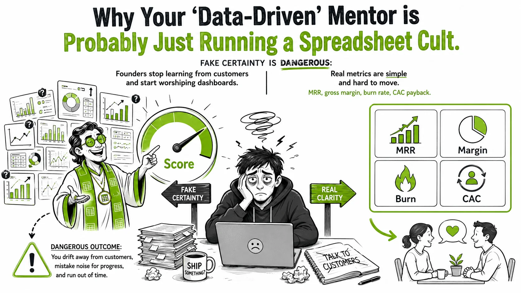
The danger isn’t that you waste time on pretty graphs. The danger is that this spreadsheet cult actively prevents you from discovering the truth about your business. It replaces the messy, human work of entrepreneurship with the clean, false comfort of a cell formula. You stop talking to customers and start worshiping the dashboard.
How much money do founders waste on this grift?
Founders collectively waste an estimated $200 million annually on “data coaching” and “metric optimization” services that are pure data-driven grift. A 2026 report by Gartner noted that 45% of seed-stage startups now list a “data consultant” as a major expense, up from 12% in 2022. The average cost for a “dashboard audit” from a top LinkedIn guru is $8,500. For that price, you could build a working prototype, run two months of Google Ads to real customers, or hire a part-time developer. Instead, you get a color-coded sheet telling you your “content resonance score” is up 3%.
Why does this culture prey on founder psychology?
Uncertainty is the founder’s constant companion. The spreadsheet cult sells the one thing a founder craves more than money: certainty. It’s a psychological shield. If the “North Star Metric” is up and to the right, then the gnawing fear that you’re building a product nobody wants must be wrong. This dynamic is expertly exploited. Gurus frame simple metrics as “unsophisticated” and their complex systems as “the professional’s toolkit.” To question the data is to reveal yourself as an amateur. This is a classic cult tactic: redefine the language to control the narrative.
What’s the real cost beyond the invoice?
The real cost is opportunity cost and organizational decay. Teams learn to optimize for what’s measured in the cult’s dashboard, not what creates value. Marketing stops testing ads that drive sales and starts creating content that drives “engagement minutes,” a classic vanity metric. Engineering builds tracking for 50 new behavioral events instead of the one feature users are begging for. I consulted with a company that had a 92% “user satisfaction score” from in-app polls but a 7% monthly retention rate. They were a happy spreadsheet cult marching off a cliff. This misalignment is a faster killer than competition, a lesson many learn too late in their hub startup journey.
Can this actually kill a viable business?
Absolutely. By the time the cult’s fake analytics collide with reality—usually when the bank account hits zero—it’s often too late to pivot. You’ve burned 18 months and $500,000 optimizing for “social share of voice” while ignoring a CAC that’s triple your LTV. The post-mortem will show a beautiful, green dashboard on the day the servers shut down. This is the ultimate data-driven grift: it doesn’t just take your money; it convinces you to willingly misallocate all your other resources while feeling smart. For more on how narratives override reality, see our analysis of entrepreneurial storytelling gone wrong.
How to Spot and Escape the Spreadsheet Cult
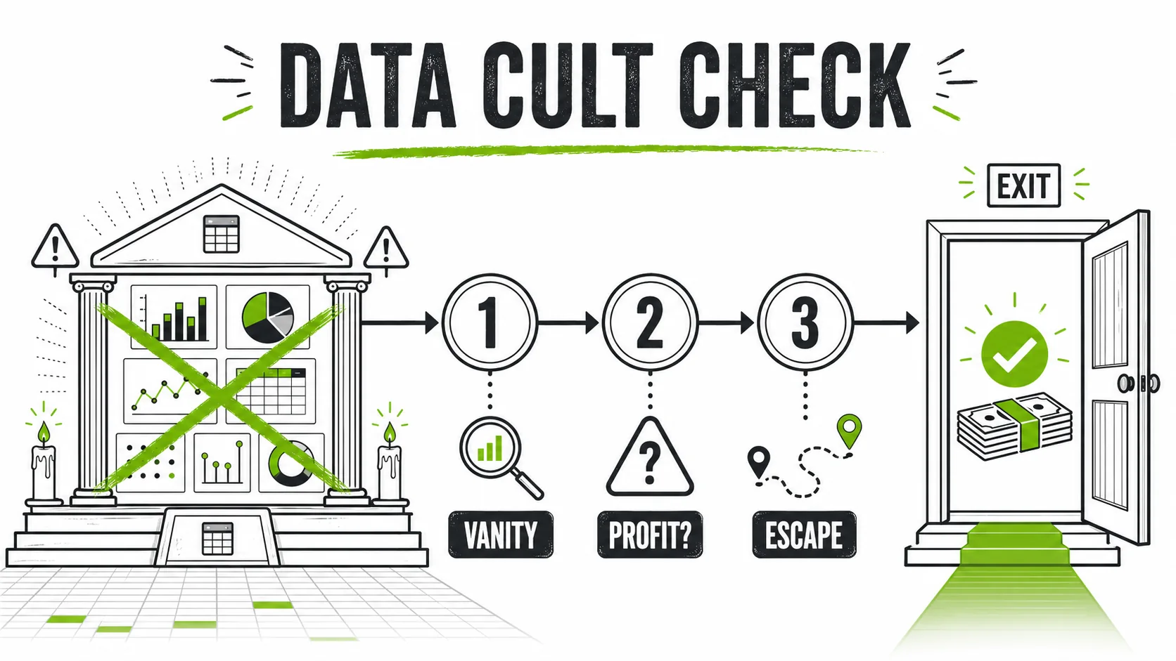
Escaping the spreadsheet cult requires a blend of skepticism, simplicity, and the courage to embrace uncomfortable numbers. This isn’t about being anti-data. It’s about being anti-bullshit. The following steps are your deprogramming guide.
Step 1: Demand the "So What?" for every metric.
For every chart, gauge, or number your guru presents, ask this exact question: “So what? What decision do we change if this goes up by 20%?” If the answer is vague (“It shows positive momentum!”) or leads to another metric (“Well, that feeds into our engagement quotient…”), you’ve found a vanity metric. A real metric has a clear action tied to it. “If our CAC payback period exceeds 12 months, we will pause all paid marketing and double down on referral incentives.” That’s a metric that matters. According to a study by MIT Sloan Management Review, teams that rigorously apply the “So What?” test reduce irrelevant reporting by 70% within a quarter.
Step 2: Locate the revenue cell.
Open the master dashboard. Use Ctrl+F. Search for “revenue,” “profit,” “cash.” How many clicks does it take to find a current, unambiguous dollar amount? In a true spreadsheet cult, this number will be buried, small, or absent, replaced by “Annual Recurring Revenue (ARR) projected” or “Estimated Pipeline Value.” I audited a “growth mastermind” template sold for $2,999. The real revenue field was on tab 17 of the workbook, in a 10pt grey font. The “Viral Coefficient” was on the front page in 24pt bold green. If you can’t see your money at a glance, you’re in a cult.
Step 3: Audit for manual data entry.
Here’s the dirty secret of the data-driven grift: most of these beautiful dashboards are maintained by an intern manually copying numbers from Stripe, Google Analytics, and Mailchimp into a Google Sheet every Monday morning. Ask: “Is this dashboard automated? Can I see the data pipeline?” If they balk, you’ve found the man behind the curtain. Real data stacks are automated via APIs. Cult data stacks are held together by ritual and hourly labor. The 2026 exposé by TechCrunch on “GrowthGod’s Dashboard” found that 80% of its “real-time” data was entered by hand, often with “judgment calls” to “smooth out anomalies” (read: make the line go up).
Step 4: Check for metric multiplication.
Cult leaders love to invent new composite metrics. They’ll take “Number of Logins” and “Time on Page,” multiply them, and call it “User Investment Score.” This is numerology, not analysis. Demand the source. Ask, “Who invented this formula? What peer-reviewed study or historical business case proves it predicts success?” There won’t be one. These formulas exist to be opaque and proprietary, reinforcing the guru’s unique value. Stick to standard, well-understood startup metrics. As one seasoned VC told me, “If I need a legend and a priesthood to understand your KPI, I’m not writing a check.”
Step 5: Follow the money (their money).
Where does the guru’s revenue actually come from? Is it from a successful product company they built, or is it from selling coaching, dashboards, and courses to anxious founders like you? The March 2026 investigations revealed that the loudest “data-driven” influencers on social media had 90% of their income from teaching entrepreneurship, not from practicing it with skin in the game. This is the core of the data-driven grift: they are not solving the problem of business; they are solving the problem of their own revenue by monetizing your anxiety. Check their LinkedIn. If their “case studies” are all other coaches, run.
Step 6: Reinstate the weekly "ugly number" review.
Replace the 2-hour dashboard worship session with a 30-minute “Ugly Number” meeting. The agenda has one item: each person shares the one metric from their domain that is most worrying, and what they’re doing about it. No slides. No animations. Just: “Our trial-to-paid conversion dropped from 8% to 5% last week. We think it’s the new pricing page. We’re A/B testing the old one right now.” This practice, used by companies like Superhuman, forces engagement with reality. It shifts culture from “looking good” to “fixing problems.”
Step 7: Calculate your own "Cult Risk Score."
Take this quick audit. Give yourself 1 point for each “yes”:
- Does your main dashboard have more than 10 distinct charts/gauges? (1 pt)
- Do you track more than 2 metrics that don’t directly tie to revenue or cost? (1 pt per metric, max 3 pts)
- Have you paid more than $1,000 for a “metrics template” or “dashboard system”? (2 pts)
- Does your mentor/advisor dismiss simple questions about profit as “short-term thinking”? (3 pts)
0-3 points: You’re probably fine. 4-7 points: You’re flirting with cult doctrine. 8+ points: You’re drinking the Kool-Aid. It’s time for an intervention. For a deeper dive into auditing misleading data, our guide to fake revenue screenshots is essential reading.
Step 8: Build a "Single Source of Truth" that fits on one page.
Your antidote to fake analytics is radical simplicity. Create one page—a physical piece of paper, a single Google Doc, a Notion page—with these five numbers, updated weekly:
That’s it. This is your compass. Every other piece of data should answer one question: “Is this helping move one of these five numbers?” If not, stop tracking it. You’ve just saved 10 hours a week and exposed any data-driven grift trying to complicate your life.
Proven Strategies to Reclaim Your Data (and Your Sanity)
Moving beyond detection requires building new, healthier habits with data. The goal is to turn it from a tool of obfuscation back into a tool of illumination. These strategies are what real, scaling companies use to stay honest.
Institute a "Metric Sunset" policy.
Most vanity metrics are immortal. They get tracked forever, long after they’ve lost meaning. Implement a policy: any new metric must have a defined “sunset clause” and an explicit owner. For example: “We will track ‘Feature X Adoption Rate’ for 8 weeks post-launch to gauge initial uptake. After that, it will be archived unless the product team petitions to extend.” This forces intentionality. At the company where I was an analyst, this policy killed 60% of our tracked metrics within a year, letting us focus on the 40% that actually drove decisions. It’s the bureaucratic equivalent of “Does this spark joy?”
Run a monthly "Data Source Autopsy."
Once a month, pick one key number—say, your “Lead Conversion Rate.” Don’t just look at the number. Trace it backward. Where does the “lead” count come from? (Is it a form submission, or just a website visitor?) Where does the “conversion” count come from? (Is it a Stripe subscription, or just a user hitting a “success” page?). You’ll often find seams where definitions get fuzzy and numbers get inflated. A 2025 report by Segment found that 33% of companies have significant discrepancies between their marketing and finance definitions of a “customer.” Closing these gaps kills the habitat where fake analytics thrive.
Use "Pre-Mortems" for major decisions.
Before launching a new campaign or feature based on a dashboard insight, run a pre-mortem. Gather your team and say: “Imagine it’s six months from now, and this initiative has failed completely. Why did it fail?” Write down every reason. You’ll often find that the “data” you used was fragile, the startup metrics were the wrong ones, or you were optimizing for a dashboard cell instead of a human need. This practice, grounded in decision psychology, inoculates you against the overconfidence that complex charts create. It’s a forced dose of the uncertainty the spreadsheet cult tries to erase.
Find a "Data Buddy" outside your company.
This is your secret weapon. Find a trusted founder or product lead at a non-competing company. Once a month, share your one-page “Single Source of Truth” with them, and have them share theirs. The external, dispassionate eye is immune to your internal cult logic. They’ll ask the obvious, devastating questions you’ve stopped asking: “Why is your burn so high for so few customers?” or “Your MRR is growing, but why did paying customer count drop?” This simple practice breaks the echo chamber and is a hallmark of resilient hub startup networks that value truth over hype.
Got Questions About the Data Grift? We've Got Answers.
My mentor says focusing on revenue early is "small thinking." Are they right?
They are dangerously wrong. This is a classic cult mantra to devalue the ultimate measure of value creation. “Small thinking” is building for 24 months with no income. “Big thinking” is finding a single person who will pay you $5 for your solution today. That $5 is more valuable than any dashboard. Every iconic tech company, from Facebook to Salesforce, had a revenue model (even if flawed) from the early days. The idea that you should ignore money until you’re “big” is a luxury belief sold by people whose revenue comes from selling you that belief.
What if my complex metrics do eventually predict revenue?
That’s great—when you’ve proven it. The grift is in claiming the predictive link before you have evidence. The scientific approach is to hypothesize (“We think ‘weekly active teams’ predicts enterprise contract renewals”), then test it over multiple quarters with real financial outcomes. Until you have a statistically significant correlation (e.g., “Teams with >50 weekly active users have a 90% renewal rate”), it’s just a guess. Don’t let the guess become dogma. Many vanity metrics feel predictive but aren’t. MySpace had astronomical “active users” and “page views.” It didn’t predict survival.
Aren't all startups a bit of a cult? Isn't that how you build belief?
There’s a difference between a team believing in a mission and a team believing in a manipulated dataset. The first is passion. The second is delusion. You need believers to weather the storm, but you need skeptics to check the maps. A healthy culture debates data; a cult culture venerates it. If your team’s “belief” is contingent on a “Weekly Vibrancy Index” staying green, you haven’t built a company. You’ve built a house of cards on an Excel spreadsheet.
I think I've bought into a grift. How do I fire my data guru without blowing up my team?
First, stop the bleeding. Politely cancel any recurring contracts. You don’t need a dramatic confrontation; just say you’re “simplifying your operational focus.” Then, lead the deprogramming yourself. Call a team meeting and say, “We’ve been tracking a lot. I think we’ve lost the plot. Let’s wipe the slate and rebuild our metrics together, starting with cash and customers.” Frame it as a strategic pivot toward clarity, not an admission of being scammed. Your team is likely as exhausted by the ritual as you are. They’ll probably be relieved.
The most important metric is the one you’re afraid to track. The cult sells you a dozen others to keep you from looking at it. Real data isn’t about certainty; it’s about slightly less wrong guesses. It’s a flashlight in a dark room, not a neon sign pointing to a guaranteed exit.
Ready to spot the performance before you buy the ticket? We analyze the tactics, language, and fake analytics of the modern guru so you don’t have to learn the hard way.
<!-- sister-projects-start -->
Other Doved Studio projects
Related tools from the same studio you might find useful:
- Ralphable: Generate structured Claude Code skills that iterate until pass/fail criteria are met.
- Doved Studio: Studio indie derrière cette app et une dizaine d'autres outils.
<!-- sister-projects-end -->